Problem
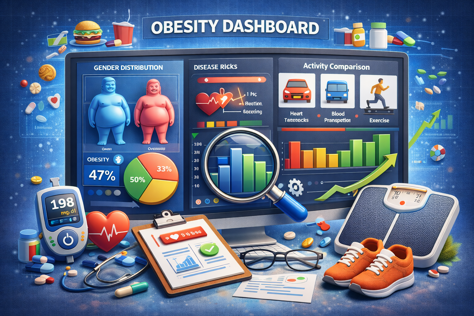
Obesity data contains multiple geographic, demographic, and temporal dimensions that are difficult to understand from static tables alone. The project turns the dataset into an interactive dashboard that lets users explore patterns and compare population groups visually.
The intended audience includes analysts, students, and public-health stakeholders who need an approachable way to inspect differences without writing code.
Constraints
Health datasets often combine categories, regions, age groups, and reporting periods with incomplete or uneven coverage. Comparisons can become misleading when users overlook differences in population definitions or data availability.
A public dashboard also needs to balance analytical flexibility with fast loading and a simple interface. The application is deployed on a resource-constrained hosting tier, so expensive transformations should not be repeated unnecessarily for every interaction.
The project is exploratory and should not be interpreted as medical advice or a causal analysis of obesity.
Approach
Pandas is used to clean, reshape, filter, and summarize the source data. Bokeh provides linked interactive charts and controls so users can examine geographic and demographic patterns from the same application.
The interface emphasizes exploratory comparison rather than a single fixed conclusion. Users can change the selected dimensions and observe how the distributions and trends respond.
Data preparation is performed before visualization so chart callbacks operate on consistent, analysis-ready structures.
Validation
The transformed dataset is checked against the source for expected categories, missing values, and aggregate consistency. Representative filters are tested to ensure that controls update the correct subset and that chart labels remain synchronized with the selected data.
Visual validation includes checking axes, legends, units, empty states, and responsive behavior. Extreme and missing values are inspected to avoid silently distorting chart ranges.
The deployed application provides a final integration check for startup behavior and asset loading in the hosting environment.
Engineering decisions
Bokeh was selected because it supports Python-based interactive visualization without requiring a separate JavaScript frontend. This keeps the analytics and interface logic close to the data-processing code.
The project separates data preparation from dashboard construction so changes to the dataset do not require rewriting every visualization. Hosting on Render makes the application directly accessible from the portfolio.
The repository contains the source and environment definition needed to reproduce the dashboard.
Tradeoffs
The dashboard favors exploratory clarity over a large number of charts. It does not attempt to establish causal relationships or build a predictive health model.
A Python-hosted interactive application is convenient but can have slower cold starts than a fully static visualization. More extensive caching or precomputed extracts could improve responsiveness for larger datasets.
Next steps
Future work could add clearer data-source documentation, downloadable filtered data, confidence intervals where available, richer accessibility descriptions, and automated tests for transformations and callbacks.
A static summary mode could improve initial load time, while a more detailed methodology page could explain the limitations of cross-country and demographic comparisons.